And


And
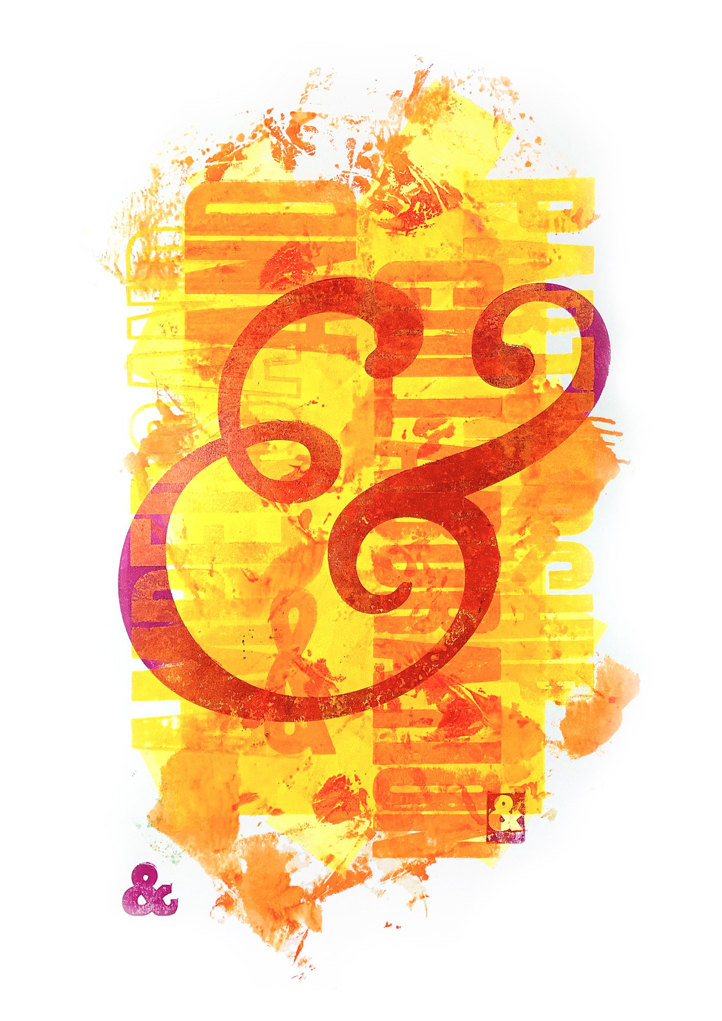
‘And’, a graphic representation of the ampersand!
In the first century, Roman scribes wrote in cursive, so when they wrote the Latin word ‘et’ meaning ‘and’, they linked the E and T. Over time, the ‘&’ ligature’ came to signify the word ‘and’ in English. Certain older typefaces clearly reveal the origin of the ampersand shape, but nowadays it comes in many shapes and forms creating a decorative logogram. The oversized ampersand used in this print is Goudy Italic.
In the early 19th century, school children reciting the alphabet always ended with the letter & as the 27th letter, or ampersand as it then became known. The name was derived from ‘and-per-se-and’ where ‘per se’ means ‘by itself’, so the alphabet concluded X, Y, Z and by itself &.
This large format, limited edition print celebrates the symbol in a typographic, colourful representation. It was created at the expansive letterpress studio at the North Metropolian TAFE in Perth, Australia, using a 19th Century Colombian press.
Size: 100cm x 66cm
Edition: Limited to 14 (7x Yellow, 7x Green)
Paper: 297gsm Crane & Co 100% Cotton
Ink: (PMS 803 Neon Yellow + PMS 804 Neon Orange), (PMS 802 Neon Green + PMS 801 Neon Blue) + PMS 807 Neon Magenta
Please note: Each poster is unique, the prints are hand inked and hand printed and variations may occur in the finish of the ink and type textures.
All posters are sold unframed and will be carefully wrapped in tissue paper and shipped in a cardboard tube. Prices include GST where applicable.
